Adding Images to History Snacks Without Making Things Louder
I recently released a new version of History Snacks that adds illustrations to historical events.
On the surface, this sounds like a simple visual upgrade. In practice, it forced a series of decisions about tone, accuracy, and restraint — and those decisions ended up shaping the experience far more than I expected.
History Snacks has always been about small, self-contained moments in history. Each event is meant to stand on its own: brief, readable, and complete without demanding attention. Adding images risked undermining that. Images can easily dominate, dramatize, or mislead.
So the first question wasn’t how to add images, but whether they belonged at all.
What the images are — and what they are not
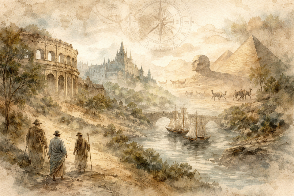
The illustrations added to History Snacks are intentionally interpretive. They are not reenactments, reconstructions, or attempts at historical realism. They’re closer to visual footnotes — a sense of atmosphere or place rather than an assertion of fact.
This distinction matters.
Photo realistic imagery carries authority, whether it deserves it or not. In the context of history, that authority can blur the line between documented fact and modern interpretation. I wanted to avoid that entirely. Hence, I went for a water color painting based depiction of the event.
If an event has an image, it’s there to encourage a brief pause before reading. If an event has no image, nothing is missing.
That constraint ended up being more important than the images themselves.
Before and after
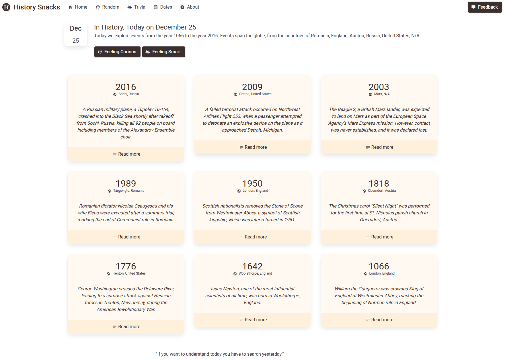
Before the change, History Snacks was text-forward and minimal. It worked, but the experience was dense in a way that required more cognitive effort than I wanted.
After adding illustrations, the site didn’t become more exciting — it became calmer.
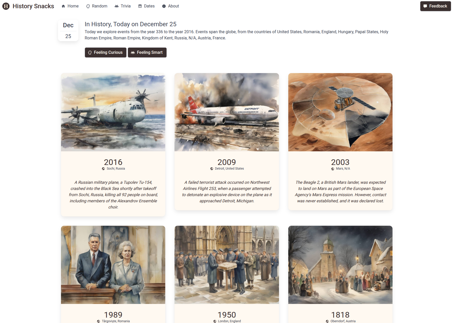
Events feel more evenly paced. The eye has a place to rest. Scrolling feels less like consuming a list and more like browsing a collection. The difference is subtle, but immediately noticeable when the two versions are compared side by side.
That subtlety was the goal.
Why I generated everything locally
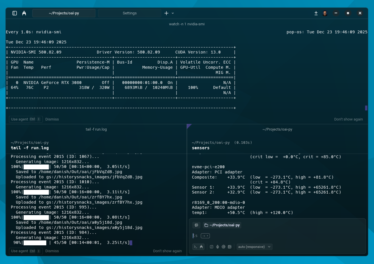
Once I committed to adding images, I also decided to generate them locally rather than rely on cloud GPUs.
This wasn’t a cost optimization exercise or a performance challenge. It was about proximity.
Running the entire pipeline on my own machine — over roughly thirty-three hours of continuous runtime — changed my relationship with the process. Watching a system you own do sustained, creative work builds a kind of trust that dashboards and APIs don’t.
It also enforced discipline. When generation is slow and visible, you think harder about resolution, style, and whether something is worth generating at all.
Those constraints improved the outcome.
A note on restraint
The most impactful changes around this release weren’t additive.
Ads were removed.
UI affordances were simplified.
“Read more” prompts disappeared.
Adding images worked because other things were taken away.
There’s a temptation, once you start improving something, to keep going — to add modes, animations, explanations, and options. In this case, the hardest and most valuable decision was knowing when to stop.
The site feels better now not because it does more, but because it asks less of the reader.
Closing
This wasn’t a loud release. There was no launch plan or roadmap behind it — just a sequence of small, intentional decisions made over time.
History Snacks feels more complete now, not because it’s finished, but because its parts finally agree with each other.
That’s usually the moment to step back.
Comments ()